
Brand Identity Refresh
2024


Snaplii is a Canadian fintech application that enables users to purchase and use e-gift cards, make payments, and earn cash back rewards—all within a single platform. Designed to streamline the shopping experience, Snaplii is rapidly expanding across North America through partnerships in the retail, dining, and lifestyle sectors.
Project Background:
Snaplii refreshed its branding to better suit the digital retail space, shifting from a tech-heavy image to a more premium, gender-inclusive identity that appeals to younger audiences.
Challenge:
-
Refine the existing logo while preserving overall brand recognition and visual consistency.
-
Develop a versatile brand style that seamlessly adapts across app UI, PR assets, marketing campaigns, and printed materials.
Role:
Responsible for overall visual direction and key branding decisions
Cross-Functional Teams:
PR, Marketing, Product, UX Design
Timeline:
5 weeks
Where We Started
This is where we started—functional but visually fragmented. The original identity leaned toward a more traditional fintech tone, with limited emotional appeal and unclear brand personality. Without a cohesive visual system, consistency across app UI, marketing, and PR was hard to maintain. These examples made it clear: the brand needed a stronger, more unified voice.


New Faces, New Focus

Current Core Users
-
Age: 25–55
-
Demographic: Mandarin-speaking male professionals in the tech industry
-
Location: Residents in Canada
-
Discovery Channel: Local Asian restaurants and supermarkets
-
Attraction Point: Engaged by a Chinese-focused marketing strategy tailored to familiar cultural environments
Future Target Users
-
Age: 18–45 (core: 25–35)
-
Demographic: Gender-balanced, Mandarin and English-speaking users
-
Location: Residents in Canada and the U.S.
-
Discovery Channel: Local social media platforms (e.g., Instagram, Xiaohongshu)
-
Attraction Point: Drawn to local-focused, community-driven marketing with bilingual and inclusive messaging
In the Wild
Snaplii’s visual identity aligns with cash back apps like Ibotta and Raise, focusing on clarity, warmth, and everyday usefulness. The tone stays approachable and straightforward, making savings feel easy and intuitive—built to connect with younger users and anyone who loves a good deal.


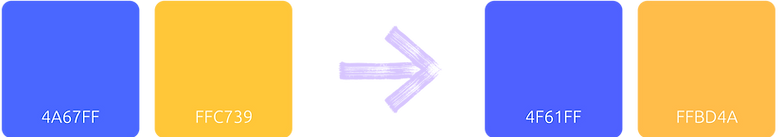
The New Face
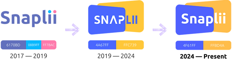
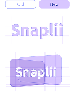
We refined Snaplii’s logo to feel sharper, bolder, and more in sync with its digital presence. By adjusting the typography for better legibility and alignment with system fonts, simplifying the colour use, and fine-tuning proportions, the new logo brings more clarity and consistency—without losing the essence of the original.
Highlights
-
We brought back the original Snaplii logotype in title case for better readability and recall. The font’s similarity to Ubuntu allows for seamless use across web and media, reinforcing brand consistency.
-
The previous two-tone letter treatment was simplified to a unified white, enhancing clarity and symbolic strength.
-
The colour and scale were subtly adjusted to enhance legibility and give the logo a bolder, more confident presence.
Messy Magic Behind the Scenes
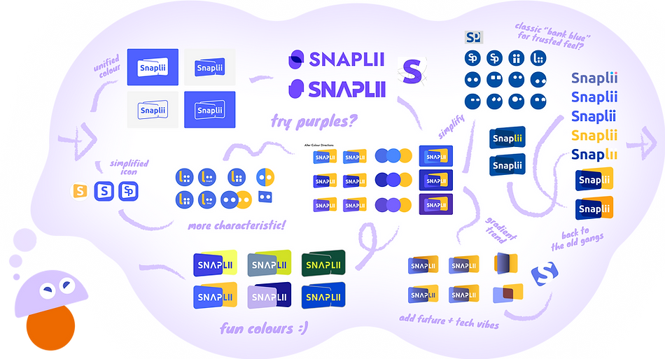
The New Hues
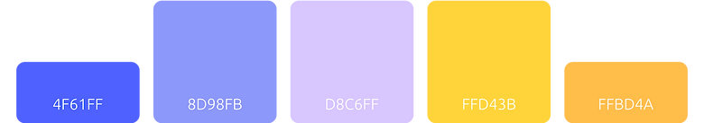
The refreshed palette combines bold blue and yellow with soft neutrals to strike a balance between vibrancy and sophistication. It ensures visual consistency across marketing, PR, branding, and digital platforms, while appealing to a broader and more diverse audience.
Primary Brand Colours
To keep the logo recognizable while giving it a fresh lift, we tweaked the colours slightly—warming it up to better match the visual weight of the blue. The subtle shift of the blue helps bring out the purplish undertone and keeps the yellow in its supportive role within the core palette.
Secondary Colours
The secondary colours serve as a visual bridge between the two primary hues—softening contrast, reducing visual tension, and offering a neutral buffer that helps avoid simultaneous contrast. At the same time, they add flexibility and bring a more contemporary, trend-aware tone to the overall palette.
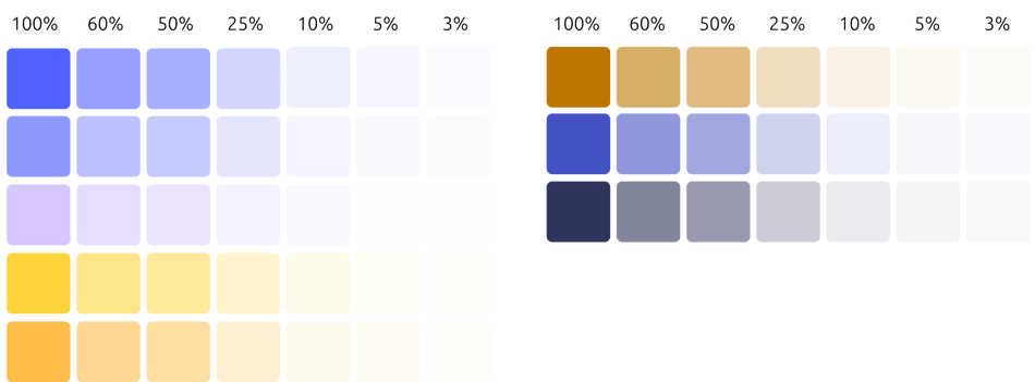
Accent Colours and Styles
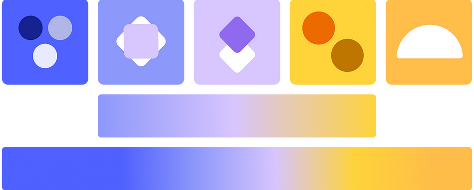
Neutrul Palette
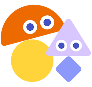
Meet the Mascots
Created a series of charming mascot-style characters to bring warmth and approachability to the visual identity, while adding consistency across app UI and marketing materials. The characters also helped expand the core user base by appealing to younger audiences and a broader, more gender-diverse demographic.

Brand in Action
Here’s how the new look plays out in real life—from app screens to social posts and campaign visuals. The system stays flexible, fresh, and on-brand across everything. I focused on keeping things cohesive while letting each touchpoint feel lively and approachable.


