
Landing with Impact
2024

Project Background:
We needed sharper visuals to raise new‑user onboarding completion and cement Snaplii’s brand consistency.
Challenge:
Show Snaplii’s value in seconds with visuals that are eye‑catching, direct, premium, and UX‑ready.
Role:
Graphic & UI Designer
Cross-Functional Teams:
Senior UX Designer, Product Manager
Timeline:
2 weeks
Before the Refresh
The previous landing pages lacked focus — inconsistent design language, unclear messaging, and lack of visual cohesion.

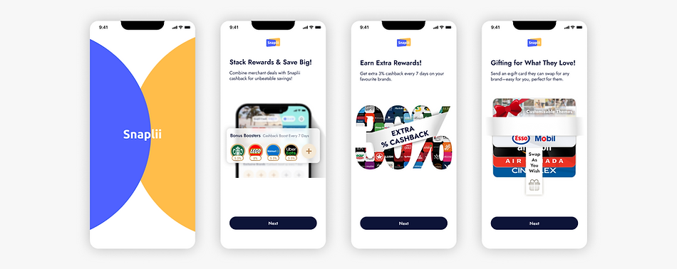
Phase I : Graphic, Please!
Phase one focused on redesigning key onboarding visuals. I led the graphic execution for major pages to ensure clarity, appeal, and alignment with product messaging.
Early Wins
The updated visuals have already led to higher registration completion rates, showing a positive impact on user perception. Interviews revealed that users found the experience clearer, more trustworthy, and felt a stronger sense of brand care and consistency. The fully branded version is expected to deliver even greater results.
Phase II : Branded & Polished
In phase two, the visuals were refined again under the updated brand system—bringing structure, consistency, and improved communication across all touchpoints.

Design that Clicks
Key considerations throughout: visual harmony, message clarity, brand consistency, and integration with UX flows.
